Line Plot Understanding Its Importance in Data Visualization

Data visualization is an essential part of making sense of complex information. Among the various tools available, a line plot stands out for its simplicity and effectiveness. But what exactly is a line plot? Why does it matter in the world of data presentation? Whether you’re tracking sales over time or observing temperature changes throughout the year, this visual representation allows you to see patterns at a glance.
In today’s digital age, where data flows like water from every source imaginable, understanding how to display that information clearly is crucial. Line plots serve as our guideposts through this landscape, helping us navigate trends and insights with ease. Let’s dive deeper into the mechanics behind line plots and explore their significance in transforming raw data into meaningful stories.
What is a Line Plot?
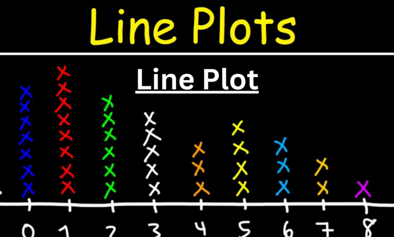
A line plot is a type of graph that illustrates data points connected by straight lines. It’s particularly effective for displaying trends over time.
Each point on the plot represents a value at a specific interval, allowing viewers to see how changes occur across different categories or time periods. This format makes it easy to track fluctuations and identify patterns, making it invaluable in various fields such as finance, science, and education.
Line plots typically feature two axes: the horizontal axis (x-axis) indicates the independent variable, while the vertical axis (y-axis) shows the dependent variable. By plotting these points and connecting them with lines, you create a visual representation that communicates information quickly and effectively.
This clarity is what sets line plots apart from other forms of data visualization. They transform complex datasets into straightforward visuals that can be easily interpreted by anyone.
How is a Line Plot Constructed?
Creating a line plot begins with selecting your data points. Choose two variables: one for the x-axis and another for the y-axis. These will form the foundation of your graph.
Next, you’ll need to establish intervals on both axes. Ensure they are evenly spaced to maintain clarity and accuracy. Mark these intervals clearly, as they guide the viewer in interpreting values.
Once your axes are ready, start plotting individual data points where the corresponding x and y values intersect. Each point represents a specific observation within your dataset.
Connect these points using straight lines. This visual connection shows trends or patterns over time or across categories. The end result is an informative visual representation that conveys information efficiently without overwhelming detail.
Benefits of Using Line Plots in Data Visualization
Line plots offer clarity in presenting data trends over time. They allow viewers to see patterns at a glance, making complex information digestible.
Another key benefit is their ability to display multiple datasets simultaneously. This feature facilitates easy comparison between different variables without overwhelming the audience.
Line plot also effectively highlight fluctuations and anomalies in the data. Sudden spikes or drops become instantly recognizable, prompting deeper analysis.
Moreover, they are versatile across various fields—finance, science, education—and can simplify decision-making processes by illustrating changes visually.
Their simplicity encourages engagement. Viewers are more likely to grasp insights quickly when faced with a clean visual representation instead of cumbersome tables or text-heavy reports.
This ease of understanding fosters better communication among team members and stakeholders alike.
Real-World Examples of Line Plots
Line plots are versatile tools that find applications across various fields. In finance, they illustrate stock price movements over time, helping investors track trends and make informed decisions.
In healthcare, line plots can depict patient recovery rates or the spread of diseases. These visualizations assist healthcare professionals in recognizing patterns and responding effectively to outbreaks.
Educators also utilize line plots for student performance data. By tracking grades over a semester, teachers gain insights into areas needing improvement.
Even in climate science, line plots represent temperature changes over decades. This data visualization method simplifies complex information, making it accessible to everyone interested in environmental issues.
These examples showcase how line plots transform raw data into clear stories that resonate with diverse audiences. They bridge the gap between numbers and understanding seamlessly.
Tips for Creating Effective Line Plots
Creating effective line plots requires attention to detail. Start with a clear title that reflects the data’s purpose. This helps viewers understand what they are looking at immediately.
Next, choose an appropriate scale for your axes. Ensure that intervals are consistent and relevant to the dataset. A well-scaled axis enhances readability and interpretation.
Use distinct colors or markers for different lines, especially if comparing multiple datasets. This differentiation aids in quick visual analysis.
Label your axes clearly, including units of measurement where applicable. Avoid clutter by keeping labels concise yet informative.
Consider adding grid lines for guidance without overwhelming the viewer. These small adjustments can significantly improve clarity and engagement with your plot.
Alternatives to Line Plots
When considering alternatives to line plots, bar charts often come into play. They excel at displaying categorical data and making comparisons between distinct groups clear.
Another option is scatter plots. These are particularly useful for showing relationships between two variables. Scatter plots can reveal correlations that might not be as apparent in a line plot.
For datasets with multiple dimensions, heat maps offer an engaging way to visualize information. By using color gradients, they highlight variations across different categories or time periods effectively.
If you’re dealing with temporal data but want more granularity, area charts could be the answer. Similar to line plots, they show trends over time while emphasizing volume changes beneath the lines.
Radar charts are ideal when comparing multiple variables across different categories. This format provides a unique view of multi-dimensional data that’s hard to capture otherwise. Each alternative has its own strengths tailored for specific visualization needs.
Conclusion
A line plot serves as a powerful tool in data visualization. It allows for the clear representation of trends over time or across categories, making it easier to analyze patterns and draw insights. With its simplicity and effectiveness, a well-constructed line plot can transform complex data into an understandable format.
By understanding how to create effective line plots and recognizing their benefits, you can enhance your data storytelling capabilities. Explore real-world examples that highlight their importance and consider alternatives when needed. The ability to present information visually is crucial in today’s data-driven world, making the line plot an essential skill for anyone working with statistical analysis or reporting.
Embracing this method will certainly elevate your approach to presenting information. Whether you’re communicating findings in a business meeting or sharing research results online, mastering the art of creating impactful line plots will serve you well.


